#49 — Antidigital
Flying saucers and skeleton apocalypse.

- Laurence King on how anti-digital design is reshaping publishing. Such a vital publisher to the creative industries – but what's going to happen when the colouring book bubble bursts?
- On the challenges of designing a book spine. My latest Creative Review column, in which I mostly lose an argument with some cereal boxes and then spend ages looking for rare back issues of McSweeney's on eBay.
- Tips for getting your novel published during a skeleton apocalypse. Useful.
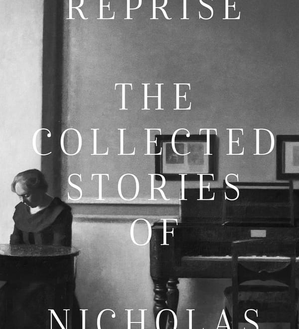
- Old book, new look – why the classics are flying off the shelves
- How long did famous novels take to write? And who doesn't love a nice big round infographic?
- It's Nice That look at Monotype’s new retro sci-fi typeface Posterama, designed by Jim Ford. Expect this to appear on Typeset in the Future… in the future.
- Jack Womack's new book, Flying Saucers are Real!, tracks UFO imagery from the 50s and 60s. Creative Review have some pics.
- Tall order – Theo Inglis considers the use of tall type and seeks out striking examples of ultra-condensed type.
- Is literature better at coming up with complex women protagonists than Hollywood? A long history of book-to-film adaptations suggests so.
- Making an art poster – a free 35-minute Skillshare class with Mr Chip Kidd. You can't beat a spot of Skillshare in the afternoon.