#65 — Gursky
Shorn of the distractions of its particular context.
Here you go, another list of distractful, vaguely design-related hyperlinks to help you fend off all of that pesky productivity that's clogging up your day:
- It’s Secret 7” time again! A simple, wonderful idea: you anonymously design a sleeve for one of this year’s chosen tracks (Jimi Hendrix, Eurythmics, Manic Street Preachers, etc.) and then it’ll be sold to raise money for mental health charity Mind.
- Trees, DNA, smells, cholera, sitcoms and bombs – Mapping London features all manner of cartographic perspectives on the capital.
- “Is the essence of reality to be found in showing a subject shorn of the distractions of its particular context?” – Rick Poynor on Andreas Gursky’s photographic massiveness and manipulation. His new exhibition at the recently reopened Hayward Gallery appears to be equal parts fantastic and frustrating.
- The best Star Wars games of the Atari generation. The Empire Strikes Back is still one of my all time favourite games.
- Excellent long read on the history and future of the Oxford English Dictionary. Talk about Sisyphean – in the time it takes you to read the article, two new words will have popped into existence.
- What colour is a tennis ball (or more importantly – because I see a LOT of them at the moment – what colour is a Minion)? The answer is surprisingly complicated.
- I love Paula Clarke Bain’s regular look at the art of the comedy index. The latest, on Richard Ayoade’s The Grip of Film, is particularly good.
- Creative Review’s humour issue is an absolute corker. Articles on Wes Anderson, Asterix, the DLR, Pet Shop Boys, Stephen Collins and John Stezaker. Plus I take a serious look at funny business on Twitter.
- Pierrick Calvez’s five minutes guide to better typography is well worth a scroll. I like the idea of hyphenated words as “language Darwinism”.
- Thomas Heatherwick: architecture’s showman. Opinion seems pretty split about The Vessel, his shiny, pointless lattice of stairs in New York, but I rather like it – although I fear it will soon become swamped by selfie-sticks and Fitbit masochists.
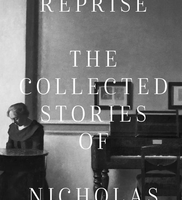
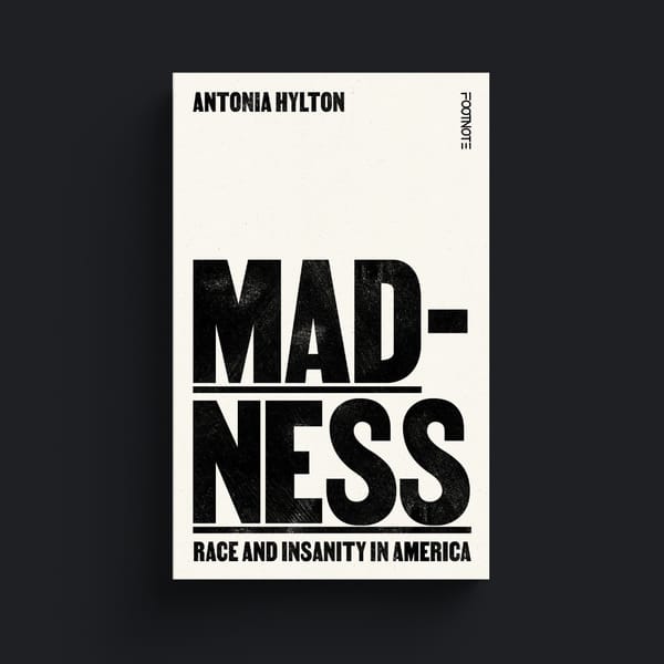
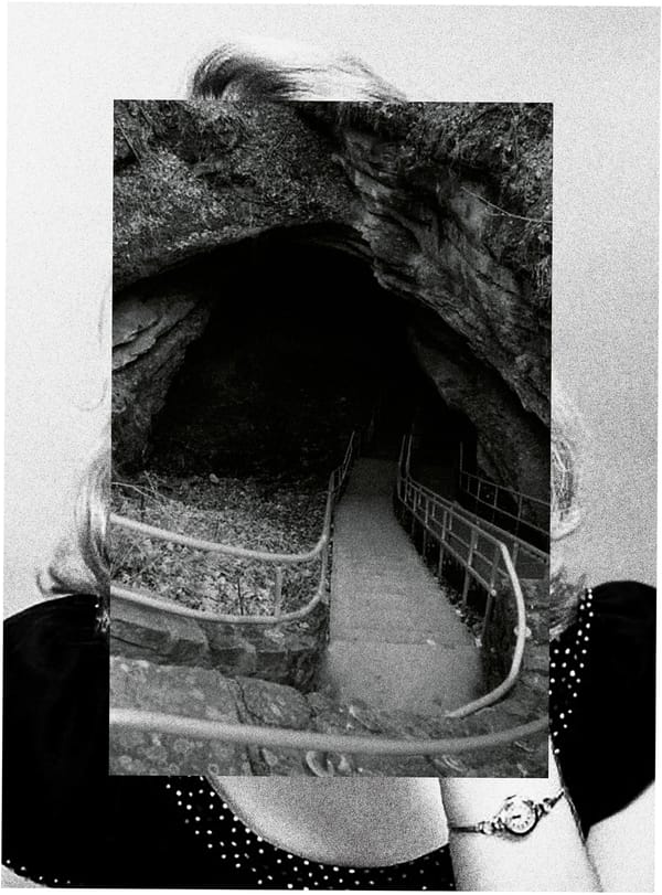
- I found myself in Bookweek’s monthly cover design roundup, which is always nice.
- Very excited about this: Dave Addey’s Typeset in the Future: Typography and Design in Science Fiction Movies, based on his blog of the same name, is available for preorder. Yes please.
- Also landing right at the top of my wishlist: Jenny Hammerton’s Cooking With Columbo.
That is all.
