House Industries

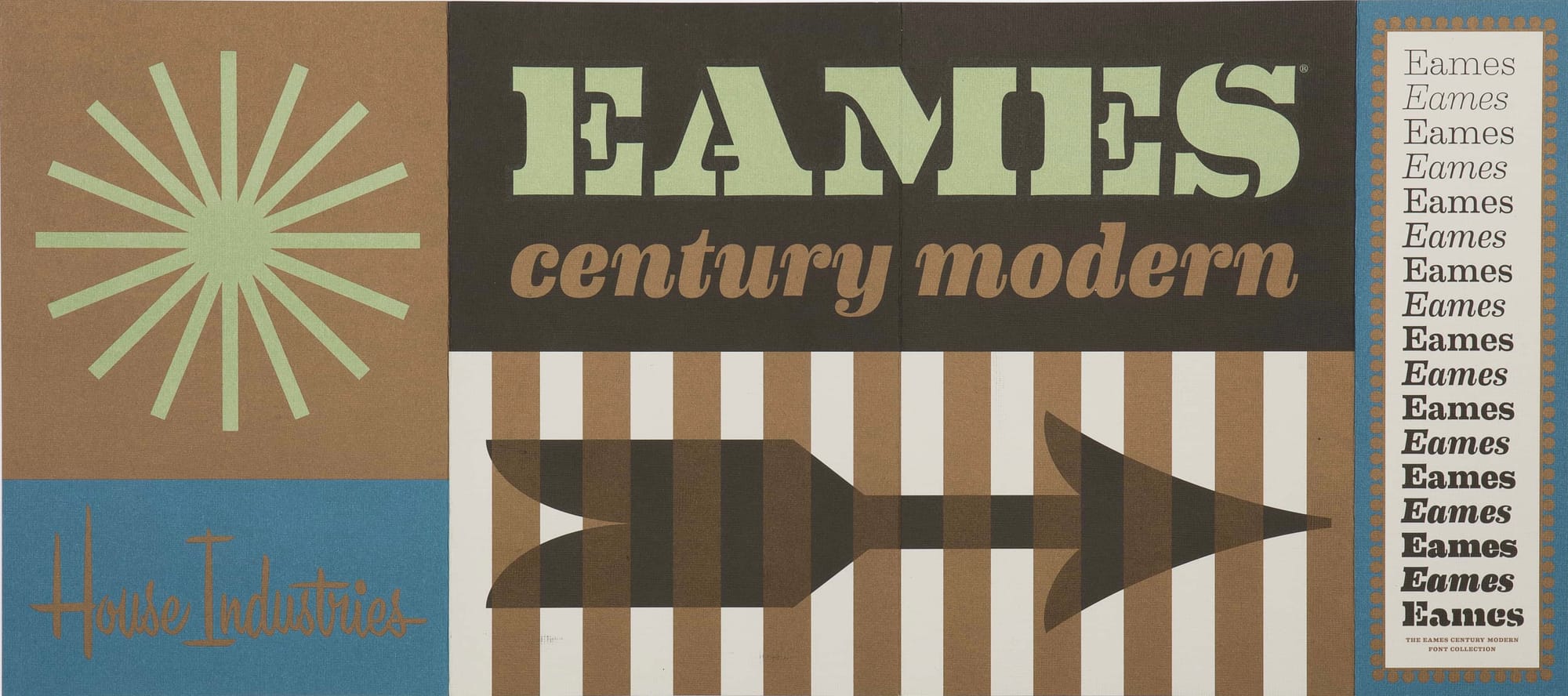
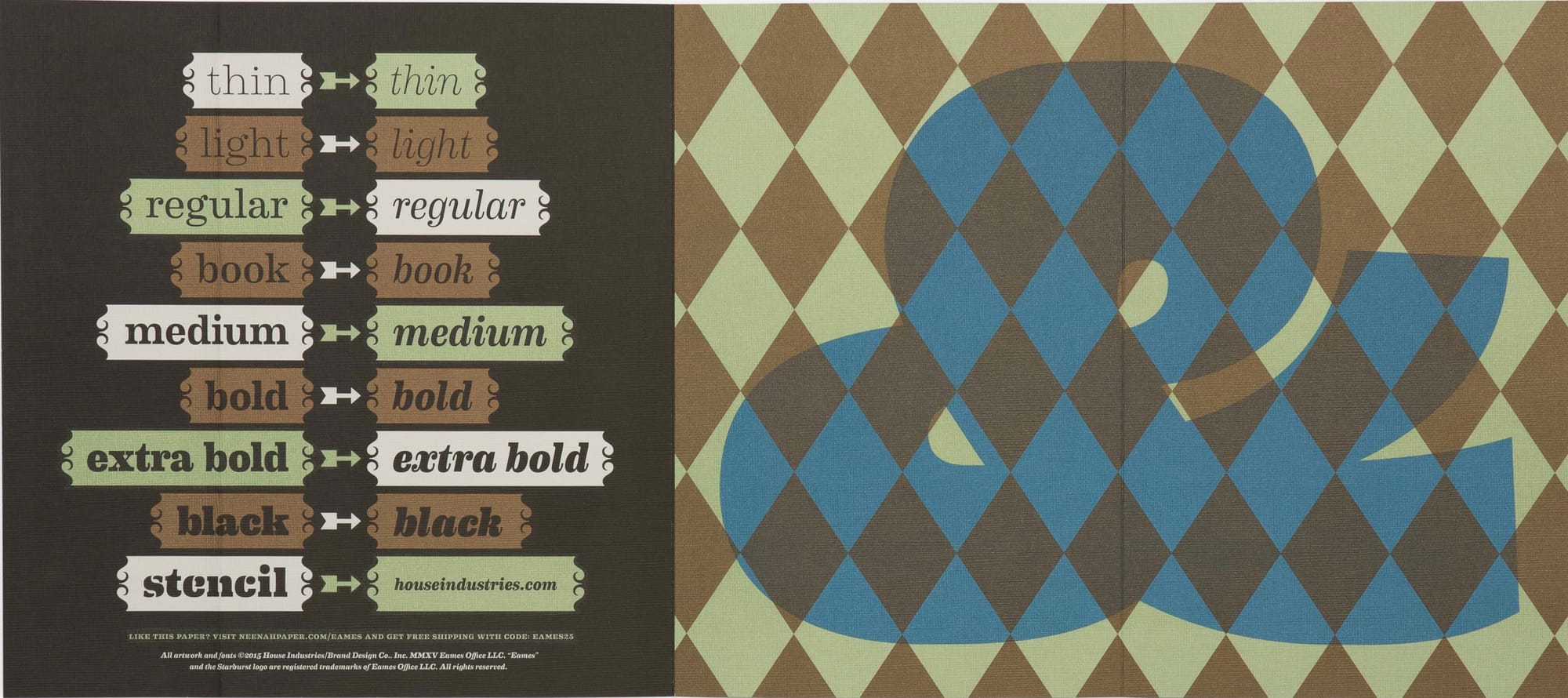
Few type foundries display as much love for their craft as Delaware's House Industries. Established in 1994, they've amassed an impressive collection of fonts, and created all manner of type-related products along the way (clothing lines, furniture, toys – not to mention their exquisitely-designed catalogues). They've recently launched a new font collection, Eames Century Modern, inspired by the work and design philosophy of Charles and Ray Eames. GCM caught up with House Industries co-founder Rich Roat to pester him about the new collection and the craft of the type designer.
You've recently launched the Eames Century Modern collection, and jolly lovely it is too. How did the project come about?
We started talking to Eames Demetrios, Charles and Ray's grandson and current standard-bearer for the estate, in the late 90s about doing a set of typefaces based on the Eames oeuvre. We went off on a lot tangents between then and now, but the stars finally aligned a few years ago and we made a deal.
It seems like a dream project. Was there a lot of pressure to get it right, to do Charles and Ray's legacy justice?
We always put a lot of pressure on ourselves to get things right regardless of the legacy we're working with. I don't think anybody can say whether we got it right or wrong, but we did create something new that promotes and honours Charles and Ray's work.
There must always be the temptation to keep on tweaking, to keep on perfecting a design – how do you know when a collection like this is finished and ready to be set free into the world?
That's the dangerous intersection where art, design, practicality and commerce come together. One of our strengths has always been driving through that intersection without dinging the fenders up too badly.
When designing a collection, how much of the work is done off-screen, using traditional crafts?
We don't like to think of on-screen vs off-screen time anymore. It would suggest that the computer affords us some sort of advantage in the creative process, which it does not. Everyone has access to the same tools. What's in our heads and hearts makes or breaks the design.
Once the design process works its way onto the computer, is it a challenge to maintain the organic, hand-crafted feel of a font?
Yeah, well that's the challenge. With Eames we could look at what Charles and Ray did with bent plywood and incorporate those organic cues into letterforms.
Do you ever reach a point where a design becomes too tidy, too digital?
If I could quote myself, I think I wrote a really poignant piece about Eames on the House Industries blog, particularly when referring to type designer Erik van Blokland:
"If you’ve ever had the occasion to sit next to Erik van Blokland while he’s serial doodling a quirky synthesis of strokes, shapes, spaces, and counterspaces that bleed from drafting pen to cocktail napkin, you’d want to work with him too. Doodling is not an exclusive skill, but translating those random inked thoughts into a synthesis of control points, curves and corners that define filled and not-filled shapes of digital type is a rare talent. This crucial point is where mere mortals lose their way. This is where typography crosses the bridge from function back to form, and nobody makes that transition quite like Erik."
The answer to that question really separates good designers from great designers. Can you transcend the tools and the medium to create something truly unique?
What would be your desert island tools of the trade – what are the things you absolutely definitely couldn't live without?
I'd want Ken Barber there with me so the large help signs we created with flammable materials looked their best for the aerial rescue team. Seriously, the tools are insignificant. On a desert island I'd just want to have my mind intact.
You work in wood, fabric, metal. In an industry of digitisation, where your core product is essentially a computer file, how important is it to keep type as tangible, as physical as possible?
You answered your own question. Even in the pre-internet floppy disk days we wanted our customers and followers to have a tangible House Industries experience. It just as important now as it was 17 years ago.
Is there a typical genesis for a new collection? Does someone excitedly burst into the office having just driven past a gorgeous bit of motel signage?
I don't want to over-intellectualize it, but our thought process runs much deeper than that. The ideas and the concepts are easy. Most of our focus is on execution, which can extend over months or years. I really can't think of a single event that led us to the Eames project.
The image of House Industries is that you make what you want to make, not following any particular trend or external demand. How do you manage the tension between creative freedom and profitability?
It's never easy, which explains why House Industries is just a slightly more sophisticated version of the original hand-to-mouth operation.
The majority of people who use type on a day-to-day basis are perfectly happy with the free fonts that come packaged with their computer. Do you ever find it difficult justifying your prices to people who take your product for granted?
We've always been passive marketers in the hopes that our customers will draw their own conclusions. I personally am the worst salesman in the world and will go out of my way to convince someone not to buy something they don't need. So I feel pretty good about our customers because, perhaps naively, I think that we've provided them with something they can use or enjoy indefinitely.
You've made and eclectic range of fonts, childrens toys, even a chair. What's next for House Industries?
Our next big push is to release Photo-Lettering, which will give a nod to some of the most influential type and lettering in the world while hopefully creating a new self-sustaining market for itself.
Originally for Gym Class Magazine

