Various Cleopatri
Louise Giovanelli in Manchester and New York, Blur’s Blur, Penguin’s archives, and other hyperlinks.

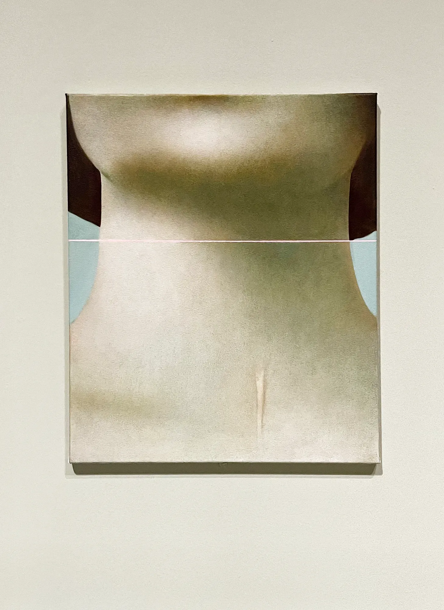
Louise Giovanelli
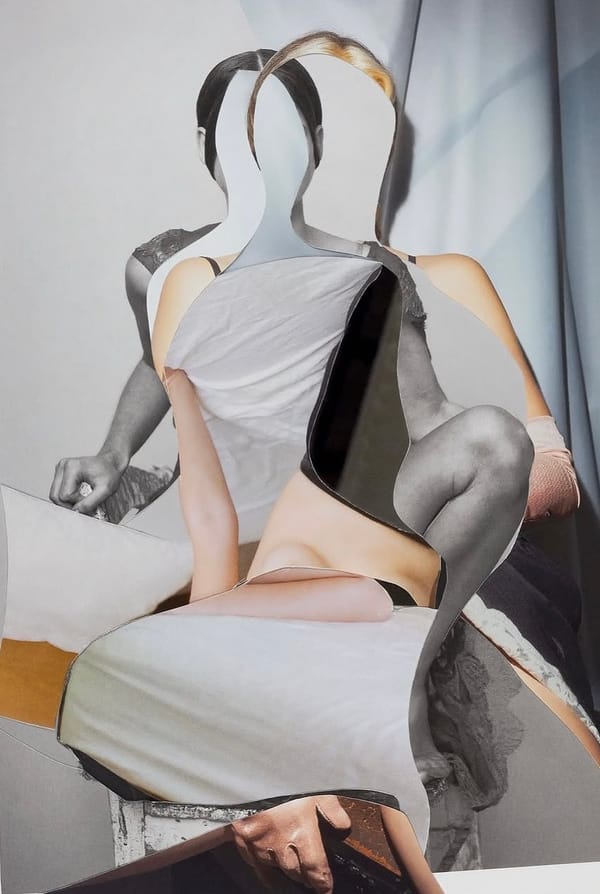
I’m utterly furious I can’t get to Louise Giovanelli’s solo exhibition at GRIMM in New York this Summer. I saw one of her Marker series at Manchester Art Gallery recently and kind of fell in love with it. The seven paintings are all based on a 1962 Bert Stern shot of Elizabeth Taylor as Cleopatra, showing off the scar from the emergency tracheotomy she received after contracting pneumonia while making the film. I love learning obscure film trivia in art galleries.
Blur
I’ve made my first ever Wikipedia edit! After a bit of lunchtime detective work and intense reverse image searching, I learnt that the image on the cover of Blur’s Blur is by American photographer Scott Goldsmith, licensed by designers Yacht Associates as a stock photo. The internet’s brain has been updated accordingly. I reached out to Goldsmith for more details and he kindly gave me a little background:
I was on an assignment at a Pittsburgh hospital … my camera was mounted on a tripod down a long hall when I noticed the gurney rolling by. I happened to be at a low shutter speed and I instinctively started to shoot. It was a nice surprise when the film was processed.
For my next trick, I want to identify the model on the cover of Leisure. If anyone has any information about the original Picture Post article on swimming hats – “Glamour in the Swim”, shot by Charles Hewitt in 1954 – let me know!
Penguin Archive
I cannot wait to get my hands on some of the Penguin Archive, celebrating 90 years of the sphenisciform publisher with new A-format paperback editions of classic texts. Reminiscent of the landmark Great Ideas series, but rather than drawing upon broader book design history, this series references Penguin’s own design heritage. Jim Stoddart talking to The Bookseller back in November:
The design process has been an extensive fever dream of books covers, old and new. Using typography as the medium to evoke different Penguin eras, we’ve reprised the creativity of many legendary designers involved with creating Penguin’s visual legacy, from the first tentative modernist covers and hand-drawn logos, to the highest evocation of type and book design.
John Self has a done a thorough breakdown of the covers on bluesky. Would love to see then all collected in a big ol’ book alongside the designs they’re referencing – that’d be one hell of a teaching tool.
(Actually, talking of hell … the best Penguins are the ones where the logo looks a bit sheepish, like it’s just waddled into shot and isn’t quite sure what to do next, so this one is particularly amazing.)
Also
- Typewriters, stinky carpets and crazy press trips – what it was like working on video game mags in the 1980s. The description of the elaborate method for taking screenshots is hilariously archaic. See also: why old games magazines are a vital source of cultural history.
- From the Domesday Book to Wingdings – the secret history of the manicule, the little hand that’s everywhere.
- That time a film crew dropped 250,000 bouncy balls on San Francisco. Twenty years later, Fallon London’s advert for Sony Bravia is still absolutely astounding.