Mark Porter
You've set up your own consultancy, Mark Porter Associates. How are you finding it, not being part of an in-house team anymore?
It's very liberating. The Guardian was a wonderful place to work for a long time, and I got to do some some fantastic projects. But I was also a head of department for a large organisation, and a lot of my time was inevitably taken up with being a manager. My main motivation for leaving was to get away from that and spend more time on the fun stuff, which is more or less what's happened. I miss the stimulus of some of the people I used to work with but it was definitely time to make the break.
You've worked all over Europe – how do find designing and writing for different languages and cultures? Do they each have their own particular challenges?
Mass media are increasingly international, and it's inevitable that there is also an international language of editorial design now. But I really value the eccentricities of different cultures and I think its important to at least try to preserve them. I didn't go to art college, I studied languages at university, and that process of understanding how a language shapes a culture is part of the fascination of the work for me. So I do try hard to get a feeling for the written and visual culture of a place when I'm working on a project. I speak some languages (French, Spanish, some Italian), and the Dutch, Swiss and Scandinavians usually speak great English, so the communication part is not usually a problem. I suppose that trying to design like a French person or an Italian is a weird kind of cultural transvestism, and you have to be careful to avoid pastiche. But I believe it's worth making the effort.
Do you prefer to work on redesigns of existing titles, helping to evolve an existing graphic language, or from scratch, with a completely blank canvas?
Both can be exciting. With existing titles there's usually more to lose, so clients can get nervous. In the early meetings they are usually very ambitious and enthusiastic for change, and then when the first dummy hits their desk and they realise that its for real, they can often panic, which is bad for creativity and innovation. But where's there's a strong vision of how a title can develop, then a redesign can be just as rewarding as a new launch.
What magazines and papers do you regularly read?
I work hard and have young kids, so like the rest of the world my time for reading is increasingly limited. The only thing I'm religious about is the New Yorker, which never disappoints. If I'm getting on a plane I'll often buy Wired or Monocle, which usually do. I'm a lifelong Private Eye reader, and of course I still see The Guardian. And I enjoy the writing in the New York Times and The Economist. But as an editorial designer, a lot of my magazine and newspaper consumption is visual skimming.
Despite the much-reported death of print, there seems to be an explosion of independent magazines at the moment. Do you think this trend will last?
I hope so. As mainstream magazines have become so terminally dull (with a few notable exceptions), we need independent magazines to keep the creativity and energy in print. Independent magazines can often be self-indulgent and take themselves far too seriously, but there's a freedom in the editing and design which is very welcome. I expect the future of print to be in smaller-circulations product with higher production values, produced with passion, so I'm sure this sector has a future.
Many of these independent titles using services such as Newspaper Club. Even the likes of McSweeneys and Radiohead have been toying with newsprint recently. Do you think there's a viable resurgance for it as a medium, or is this just a phase of appropriating an old format for kitsch value?
I think its pretty much the latter. And just because it has become relatively cheap and practical now (there are an awful lot of newspaper presses around the world working under capacity these days). Of course there's a lo-tek charm to newsprint which makes it feel right for some projects, and oversized pages are always irresistible to designers (less so to readers). But I don't think it's a sign of any appetite for newsprint in the public at large.
You were quite critical about the Independent's colourful and "macho tabloid" 2008 redesign, and the hastily turned-around 2010 rethink by Cases Asociats. How do you see it faring now?
Well they now have a rich sugar daddy to pay the bills which is what every newspaper needs these days, so I wish them luck. I never meant to be critical of the design of the 2008 relaunch, I just though it was amusing to see how the personality of Roger Alton (then editor, who I worked with at The Guardian) came through in the pages. The more recent redesign just seemed a bit half-baked and not very well thought through to me, but I don't think that was the fault of the designers. Any publication design project needs good and clear editorial thinking and I didn't feel any there. There's still a lot of talent at the Indy, but its not where I look for design inspiration.
What do you make of the i experiment?
Its intriguing. I don't understand the commercial logic (we researched something similar when I was at The Guardian and there didn't seem to be a strong case for it then). But anything that gets people reading newspapers is a good thing. And the design felt quite fresh for UK newspapers, although if you know the work that Cases Associates do all over the world its pretty familiar.
Are there any titles that you only read on screen these days?
No. I don't enjoy reading on the laptop or the desktop machine, I will usually print out anything over a few hundred words from the web. I probably read the New Yorker on the iPad about 50% of the time, but that's more about the convenience of downloading it in the departure lounge than a preference. The iPad is not a bad reading experience, but it's nowhere near as good as print.
What do you make of curated-issue apps like The Daily and Wired? Others (such as The Guardian app) seem to take a different approach, with it simply being a different, more platform-suitable method of presenting the web content – do you think one way is better than the other, and that one will come to dominate, or can the two co-exist?
The Wired model is really just about a publisher who has a big investment in printed magazines attempting to leverage that investment on a different platform. They will keep on doing it, and if tablets do become universal, it may become a viable medium for magazine publishers. But most iPad magazines of this school are not very satisfying because they have so clearly been transported from another medium and you sense that as you read them. The Guardian iPhone app works because there's an affinity between the web and mobile (both are about being fast and up-to-the-minute), but I don't see this approach making a big impact on the iPad. The daily is a much more interesting idea, as is Project, because they are conceived as tablet-only products. The problem is that they're not very good. I think that the best experiences will come from apps which are native to the device and are conceived edited and designed to that end. So far they haven't been many successful ones, but we're still learning, and I'm optimistic about the future.
As creative director of the Guardian, you oversaw the 2005 Berliner redesign and the development of guardian.co.uk. How closely do you keep an eye on what they're doing now?
I still work with them on projects as a contractor. But I try not to look too hard at the overall design of the paper and the site now. When you leave somewhere that's been a big part of your life, you have to accept that it will not continue to look as you would have chosen. It's someone else's turn to do it now.
You collaborated with Paul Barnes and Christian Schwartz on the beautiful Guardian Egyptian typeface for the redesign. Now that it's publicly available (from www.commercialtype.com), how does it feel to see one of your babies out there in the wild for anyone to mess with?
It's still a bit odd because I do feel proprietorial about it. But we developed it for a specific context, and it's great fun to see it being used in ways I hadn't expected. The worst thing is seeing it used badly or boringly. And I've just stopped using it in my keynote presentations, so maybe I'm getting over it.
Have you seen it in any peculiar places?
So far I've only seen it in the obvious places, newspapers and magazines. For some reason it seems to be big in Scandinavia. But actually, the typeface I developed with Paul and Christan for the redesign of Público in Lisbon has been a much bigger seller for them and I see that everywhere, it's even in the Evening Standard now.
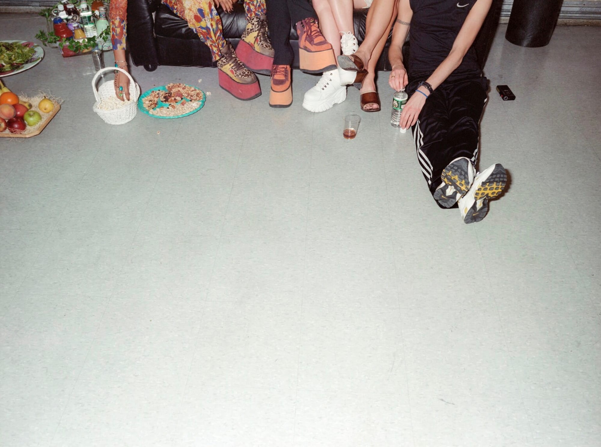
Looking a bit further back, you were behind some iconic covers in the 90s for Guardian Weekend. One that springs to mind is the Spice Girls' shoes cover, where you've got five instantly recognisable faces, ideal cover-fodder … and Nigel Shafran takes a photograph of their feet! Can you tell us a little about how that come about?
In those days, Guardian Weekend used to pride itself on avoiding the usual PR-driven celebrity interviews. We tried to reflect that visually by trying to go behind the surface and photograph celebrities with limited makeup and styling. But in some cases that was impossible. We only had access to the Spice Girls in their public persona, fully made-up and styled, but we wanted to do it in a Guardianesque way. So we assigned the late Kathy Acker (who sadly died later that year) to do the interview, and tried to select a kind of anti-celebrity photographer (Nigel). Then we briefed him to look for strange angles. My recollection is that I actually asked him to try doing some body parts (hand, feet etc), although that may be selective memory. But we certainly encouraged him to avoid anything that looked like the images of the Spice Girls we were seeing in all the other magazines and newspapers, and he did an amazing job. But he also did a great shot for the inside which did show their faces.
The combination of the interesting cropping and the full-width masthead gives it the look of an early-sixties Town cover. Are there certain titles or designers whose work you always look back to for inspiration?
Its no secret that I'm in love with the 60s and 70s. There was such incredible energy in magazines in those days, that was where the hippest photographers and designers and smartest editors wanted to be. I still love the work of Tom Wolsey at Town, Willy Fleckhaus at Twen and Dave King at the Sunday Times. It really doesn't get any better.
You said in the past that you consider yourself as more of a journalist than a designer. Has that changed?
Not really. There are plenty of people out there who are better graphic designers than I am. But I have an instinct for what readers want (and sometimes don't know they want but need) which enables me tell stories and create editorial identities and environments. Of course I love it if designers like what I do, and it's great to win design awards. But that really is the last 1% for me.
Any exciting plans for Mark Porter Associates that you can share with us?
Nothing specific. We had a busy year last year, which was a great way to start out. But when you're busy there's a danger of spreading yourself too thin, and quality can suffer. In the future I'd like to do less projects, and leave space for things which might be more creatively satisfying even if they don't pay the studio bills. And I must get round to sorting out the website!
And now the important question. You received a D&AD Black Pencil for the Guardian redesign – where do you keep it?
At the moment it's gathering dust on a shelf in the studio between some piles of paperwork and boxes of teabags. But I'm still proud of it.
Originally for Gym Class Magazine

