SPIN

Well congrats on the new design! First dumb question: why?
Devin Pedzwater: SPIN had to change. Last April, we decided to completely rethink everything about the brand. We committed ourselves to the challenge of looking beyond how we were operating and re-conceiving the SPIN brand as if it were being launched in 2012. Two key factors surfaced: First, was that the function of the brand needed to be in better alignment with our readers’ needs. In order for this to work, the magazine had to operate in harmony with the digital properties. This meant moving traditional magazine sections, like our Reviews section, online in order to focus the magazine on its core strengths: long-form journalism and engaging photography. Second, our print format was working against us. Our readers place a high value on the quality of our content and products. They expect SPIN to operate at the highest level. It's impossible to deliver on that promise in a small size with poor-quality paper. Once we started rethinking the function and form, it was clear that a major redesign was in order.
So how did ETC get involved?
DP: The SPIN design staff is small, just myself and design director Ian Robinson. We realized that taking on a massive overhaul project like this would require outside perspective. After reviewing the work of a number of design studios, it was clear that ETC’s work best reflected the goals we set with this redesign. The fact that they were creative partners with Area 17, the company who redesigned SPIN.com, was a huge plus. That made it much easier to seamlessly tie all areas of the brand together visually.
Where do you start on a complete overhaul of a magazine like this?
DP: We did months of extensive, independent audience and market research to target our demographic before making the call to ETC. We found that some of the internal assumptions that were being made about SPIN were just wrong. And it gave us the opportunity to really learn about what our readers really want from SPIN now. This information gave us the confidence to move ahead in a unified direction.
ETC: I know Devin’s start happened a lot earlier than ETC’s, but when Devin contacted us about the redesign of the magazine back in August, it was very clear in his mind that he wanted the magazine and all of the digital platforms (website, iPad, and mobile apps), as well as the marketing materials, to come from the same unique voice. We worked closely with Area 17, the digital and branding partner on the project, to help define the brand. The logo didn’t change (except for a few imperceptible bezier curves), but all the design decisions first germinated from a newfound appreciation of the brand, and particularly the redefined SPIN mission: to be the authority on new music discovery with an eye on the news, lifestyle, and culture that surrounds it. When we broke out into our respective platforms, we were all at least speaking the same language.
SPIN has been around for a long time now – it's probably older than most of its readers. How important was it to keep a sense of legacy and authority in the redesign?
DP: It was a unique problem to solve: We had to think forward while looking back. Modern media companies don’t have to think about their legacy. We see our heritage as a competitive advantage. ETC did a remarkable job of referencing SPIN’s history and shining a light on the aspects of the brand that originally established its authoritative position.
ETC: Strangely enough, the crossover rate from Web to print is only 7%, with an older demographic definitely leaning on the magazine, so we could actually cater to heritage and the people who might have read SPIN when growing up. Nonetheless, SPIN’s history is really rich and vibrant, particularly ripe in the 1980s and 1990s, but seemed to lose a sense of its identity in the mid-2000s when it went more extremely mainstream. When SPIN came to us, they wanted to return to the time when it took more risks and unearthed more difficult, undiscovered music. So in addition to returning to its original vinyl-high size, we thought the visual cues to the past, a no-nonsense approach to music journalism, would help signal this editorial return to its rich journalistic roots. We also thought the old stuff actually felt really contemporary, and so we started there, and tweaked and tweaked, and tweaked some more.
So it's not just a case of changing how the magazine looks, but how it's written?
ETC: Sure. This goes back to SPIN's change to the way it distributes content. More reviews online and longer, probing, more behind the scenes look at artists in the magazine. Some of these stories in the magazine are upwards of 4500 words which was more inline with the earlier SPINs. This just gave us more reason to take a look back.
What was more important to the process: looking at back issues of SPIN (now handily on Google Books), or looking at the competition?
ETC: To be totally honest, we really didn’t look at the competition. We saw what they were doing with design and knew SPIN, itself and its history, was way more interesting. We placed our focus on them. The most important part of our process, and certainly the most inspiring, came from looking at the SPIN archives.
It must be a tricky balancing act though: retaining the heritage of the magazine without presenting it as nostalgia for Gen X-ers? Other magazines never quite escaped their past – I'm thinking of The Face here, and how it never quite lost the "eighties style bible" tag.
ETC: We drew a lot of inspiration from old SPINs, but we never copied them. That is, we pulled out the things we liked from them that seemed relevant to SPINs new mission. That was a certain kind of selection process. To grab what seems relevant and with that, we applied them to how stories were told, how the different sections of the book broke out, and how the whole system was pulled together. From all of the ideas we started out with, they were then reinterpreted and tweaked and distorted. That was the balancing act: believing in your reference points and finding the right sensibility.
When redesigning a magazine like this – one that already has a lot that works for it – are you constantly keeping an eye on the baby to make sure it doesn't get thrown out with the bathwater?
ETC: I think this was one of the great things about our collaboration with Devin and the rest of his team. We came to the design of the magazine with fresh eyes, without any hesitations or baggage. Sometimes we came into meetings with radical approaches to the design, and I think challenged the folks at SPIN a little. You know, just to see where this thing could go. And SPIN came to the design with a wiser, more pragmatic, more music-entrenched perspective. They knew when something just wasn’t going to work. And they were very wary when the sensibility might be off. That was why we could all feel confident about the new design directions, and not feel like we were letting something go of something we might ultimately want to keep. They were cautious of that, but they were also ready to change the magazine and were very open to our interpretations. And we were all very honest in our conversations. It was just an all-around great collaboration.
The first thing I normally do with a new mag is give it a good sniff. You can't beat the fresh inky gutter of a well designed magazine. This time I was immediately struck by a different sensation though – SPIN is noisy. Every turn of a page comes with a satisfyingly creasy-crunchy noise, just to remind you you're reading something made of paper. Deliberate, or happy accident?
DP: Oh, absolutely deliberate. This thing needed to not just look like a premium product but feel, smell and sound like one, too. With the brand redesign, we looked at every platform and designed specifically to show off the properties of each platform. It’s not unlike what we did with our iPad app. People use the iPad to listen to music and read magazines. So we made SPIN Play simply do those two things really well. With the magazine, we spent a lot of time experimenting with trim sizes, paper stocks, ink treatments, and printing styles before we arrived at this solution. It was an important part of making the experience feel more like a book than a magazine.
The contrast in the different paper textures helps to delineate the sections. Music magazines all seem to have standardised over the years, one usually knows what to expect in terms of structure. SPIN has gone against the grain by shifting all the reviews out of the mag and onto the web. What sort of impact did that have on shaping the rhythm/structure of the mag?
DP: Moving reviews to the web solved two problems at once. We’re now able to respond to albums much faster online, and it frees up space in the magazine to tell broader stories related to the culture that surrounds music. We’ve evolved the idea of short blurb reviews to a critical back-of-book section called The Guide which is described as “showcasing the kind of deep, long-view critical thinking and cultural analysis that’s so often lacking today, and which SPIN originally built its reputation on.”
It's transitioned into a multi-platform title incredibly successfully, but there's always a risk of the content and, perhaps more importantly, the personality of a magazine being spread too thinly across a multitude of print, electronic and social mediums. Was this a challenge with the redesign?
DP: Actually, that was kind of the point. SPIN’s digital properties lacked the voice, tone, and personality that the magazine carefully refined over the years. Nowadays, people interact with brands holistically so we had to be certain the message is always consistent and on-brand. SPIN’s new editorial team is committed to operating from a platform-agnostic point of view. For example, an editor can write a 3,000-word cover story for the magazine while, at the same time, post timely news stories for the website.

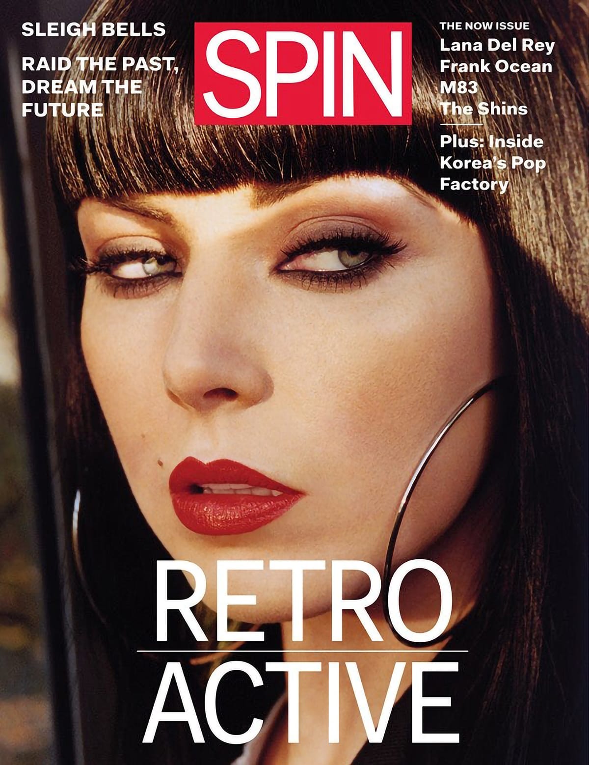
The redesign kicked off with Sleigh Bells singer Alexis Krauss on the cover, and it's one hell of a striking image – there's no avoiding that glare from the newsagents shelf. I'm always curious how much debate goes into who to put on the cover. Is it hard to resist the urge to slap Lana Del Rey on the cover like everyone else does, if it might shift a few more copies?
DP: We had to get away from chasing the hottest artist of the moment. It just doesn’t make sense for a monthly or a bi-monthly magazine to do that anymore. Instead we decided to a magazine-grade Lana Del Rey story on SPIN.com.
We believe people buy the brand and not the band. The new theme-based approach for the magazine has made it easier for us to hone in on exactly what and who we want to feature on the cover. Sleigh Bells’ retro-futuristic album was a perfect fit for the “Retro-Active” Now issue. And, already, our numbers of both subscribers and newsstand copy sales have dramatically improved, proving that this was the right move.
One last thing: what are your favourite magazines?
DP: Dazed & Confused, i-D, Monocle, and New York magazine.
ETC: Any magazine that has great content and good intentions, like The New Yorker, NY Times Magazine, Fantastic Man/Gentle Woman, or Apartamento.


